# How to Convert Image Mockups into Clean CSS Gradients
Every design handoff includes at least one background that is a smooth color transition, a hero section fading from deep indigo to violet, a card overlay shifting from transparent black to opaque. The default approach is to export that background as a PNG or JPEG and reference it in CSS. That works, but it carries real costs: an extra HTTP request, kilobytes of image data, and a static asset that cannot respond to theme changes or viewport conditions. CSS gradients solve all three problems at once.
This guide walks through the full workflow: reading a gradient out of a design file or screenshot, translating it into precise CSS syntax, and validating the result against the original.
Why Replace Image Backgrounds with CSS Gradients
Before getting into the mechanics, it is worth being clear about what you gain.
Performance. A linear-gradient or radial-gradient declaration adds zero bytes to your network payload beyond the stylesheet itself. A comparable PNG thumbnail is typically 5, 30 KB. At scale across a product with dozens of gradient backgrounds, that difference is meaningful.
Scalability. CSS gradients scale to any resolution. A background image rendered at 1x looks soft on a 3x device unless you serve a retina asset. A CSS gradient is always crisp because the browser renders it natively at whatever density the display requires.
Maintainability. A gradient stored in a design token or CSS custom property can be updated in one place and propagated everywhere. A background image requires re-exporting, re-uploading, and cache-busting.
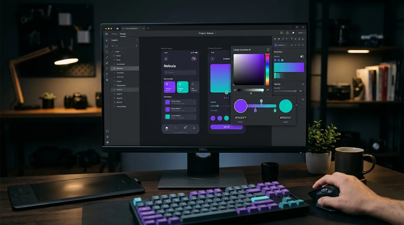
Reading the Gradient from a Mockup
The first step is to identify the color stops. Open the mockup in a design tool or load the exported image in any application that lets you sample pixel values.
Sample at a minimum of three positions along the gradient axis:
- The starting point (or corner, for diagonal gradients)
- The midpoint
- The ending point
Record the hex or RGB value at each position. If the gradient is not linear, if it curves, fans out, or originates from a point, note the geometry as well.
Tools like Gradient Scanner automate this step. You upload an image, draw a line across the gradient axis, and the tool analyzes the pixel data along that path to produce the corresponding CSS syntax. For complex gradients with many subtle stops, this approach is significantly faster than manual sampling.
Writing the CSS
Once you have your color stops and geometry, the CSS is straightforward.
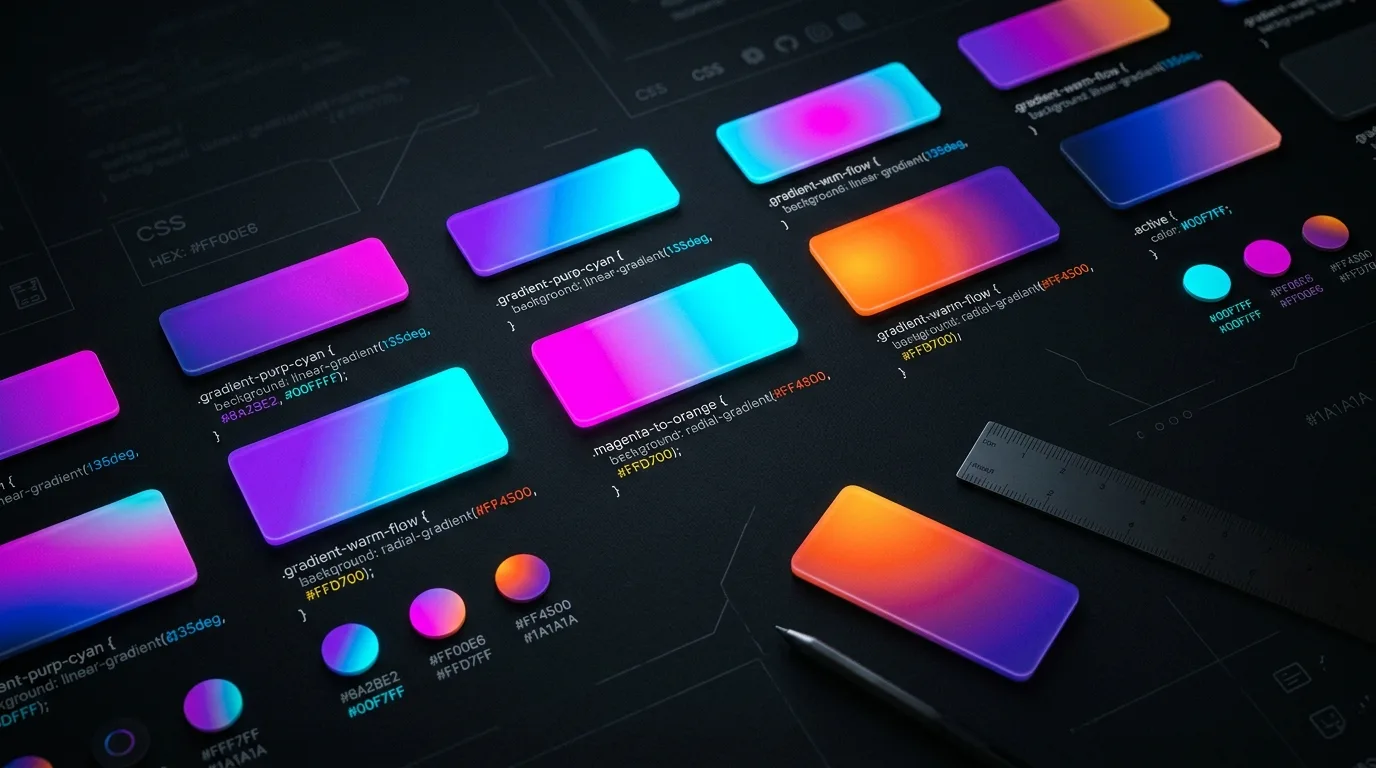
Linear Gradients
/* Two-stop horizontal gradient */
background: linear-gradient(to right, #1a1a2e, #e94560);
/* Multi-stop diagonal gradient */
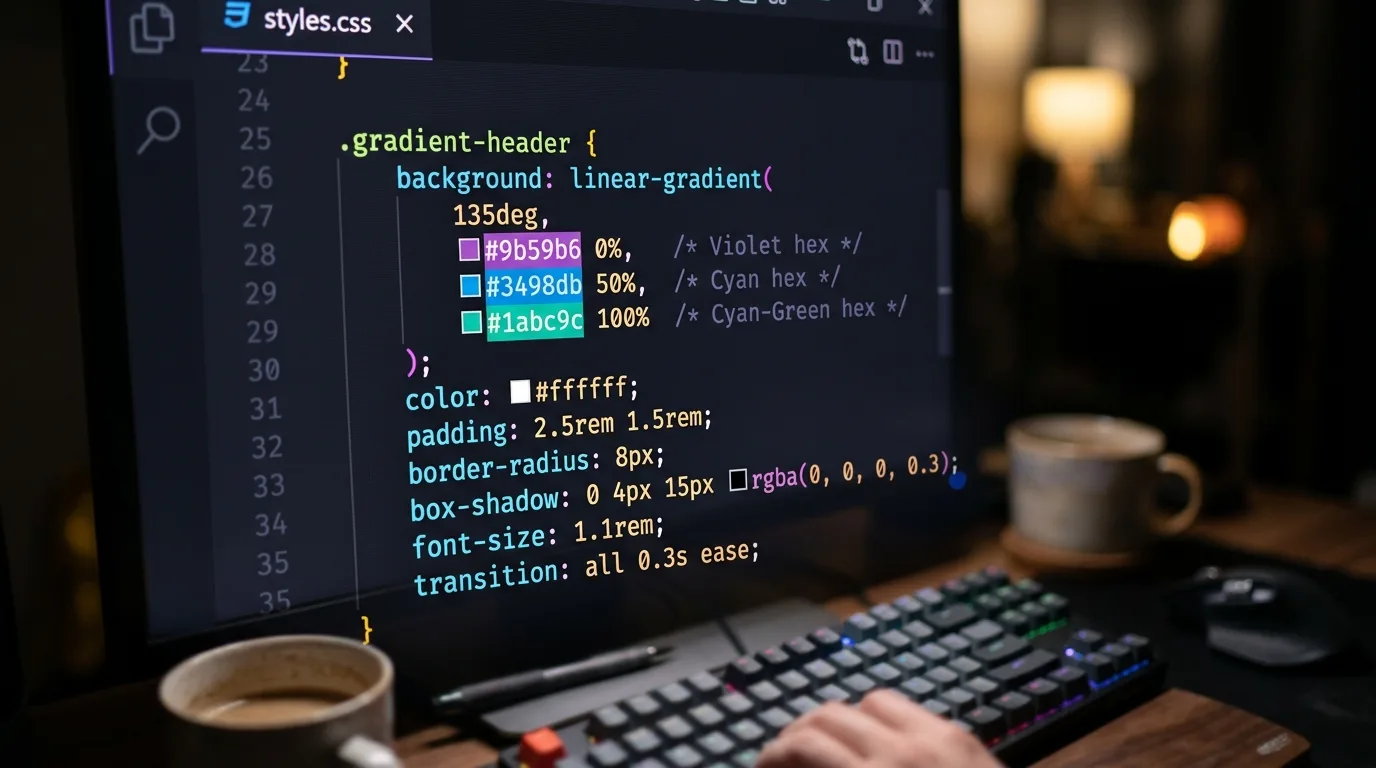
background: linear-gradient(
135deg,
#0f0c29 0%,
#302b63 50%,
#24243e 100%
);The angle can be expressed in degrees (135deg) or as a direction keyword (to bottom right). Degrees are more precise for non-cardinal directions. Zero degrees points upward; values increase clockwise.
Radial Gradients
/* Circular gradient centered in the element */
background: radial-gradient(circle at center, #f7971e 0%, #ffd200 100%);

/* Elliptical gradient offset to the top-left */
background: radial-gradient(ellipse at 20% 30%, #4facfe 0%, #00f2fe 100%);
The at keyword positions the gradient origin. This directly corresponds to the focal point you would identify when sampling the mockup.
Conic Gradients
For pie-chart-style or sweeping backgrounds, conic-gradient is the right tool:
background: conic-gradient(from 0deg at 50% 50%, #fc5c7d, #6a82fb, #fc5c7d);Validating Against the Original
After writing the CSS, place the gradient declaration in a test element with the same dimensions as the original mockup region. Load both side by side in a browser, the original image in one pane, the CSS-rendered version in another.
Check:
- Color accuracy at the start and end stops
- Midpoint color and position
- Edge behavior (does the gradient clip correctly to the container?)
- Appearance at multiple screen densities if you have access to a high-DPI display or can use browser DevTools device emulation
If the midpoint color is off, add an explicit mid-stop:
background: linear-gradient(
  to right,
  #1a1a2e 0%,
  #4a3f6b 48%,   /* explicit midpoint correction */
  #e94560 100%
);
Small adjustments to stop positions, a percent or two in either direction, are usually enough to bring the CSS rendering in line with the original.
Integrating with a Design System
Once the gradient is validated, move it into your design token layer. In a plain CSS codebase, custom properties work well:
:root {
  -gradient-hero: linear-gradient(135deg, #0f0c29 0%, #302b63 50%, #24243e 100%);
  -gradient-card-overlay: linear-gradient(to bottom, transparent 0%, rgba(0,0,0,0.7) 100%);
}

.hero {
  background: var(-gradient-hero);
}
In a design token pipeline (Style Dictionary, Theo, or similar), store gradients as composite tokens with explicit stop arrays so they can be serialized to multiple output formats, CSS custom properties, iOS Swift, Android XML, from a single source of truth.
Common Pitfalls
Using `background-image` vs `background`. Both work, but background is shorthand that resets other background properties. If you need to combine a gradient with a background-size or background-position, use the longhand:
background-image: linear-gradient(135deg, #0f0c29, #24243e);
background-size: cover;
Forgetting the fallback. For contexts where CSS gradients might not render (email clients, very old embedded views), add a solid color fallback before the gradient:
background: #0f0c29; /* fallback */
background: linear-gradient(135deg, #0f0c29, #24243e);
Overcomplicating stops. Gradients extracted automatically from images sometimes include redundant stops that are nearly identical in color. Simplify to the minimum number of stops that reproduces the visual, this keeps the CSS readable and reduces the chance of banding artifacts on some rendering engines.
Summary
Replacing gradient background images with CSS is one of the higher-leverage optimizations available to a front-end developer. The performance gains are real, the result is more maintainable, and the workflow, sample, write, validate, tokenize, is repeatable across any project. Tools that automate the extraction step, such as Gradient Scanner, reduce the most tedious part of the process to a few seconds of work.